HelloFresh Marketplace —
Building a white label marketplace to enable efficient cross-selling & offering diversification
I co-led design on a domain we called "Food" (yes, food :)), we managed the food that's sold and how we sell it to customers.
My recent years' contributions, when combined, result into a huge make-over of the HelloFresh shopping experience and shaped the HelloFresh Group white-label marketplace system.
Find below my most impactful contributions as a Lead Product Designer contributing across 4 squads.
Project background
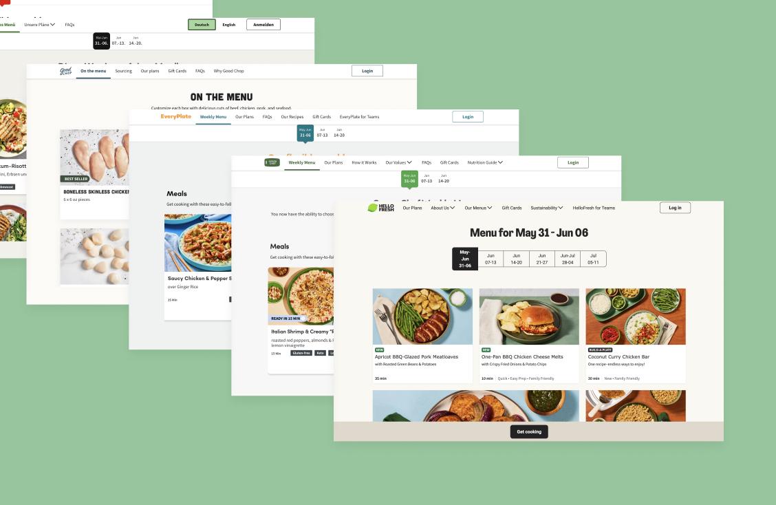
HelloFresh had big plans
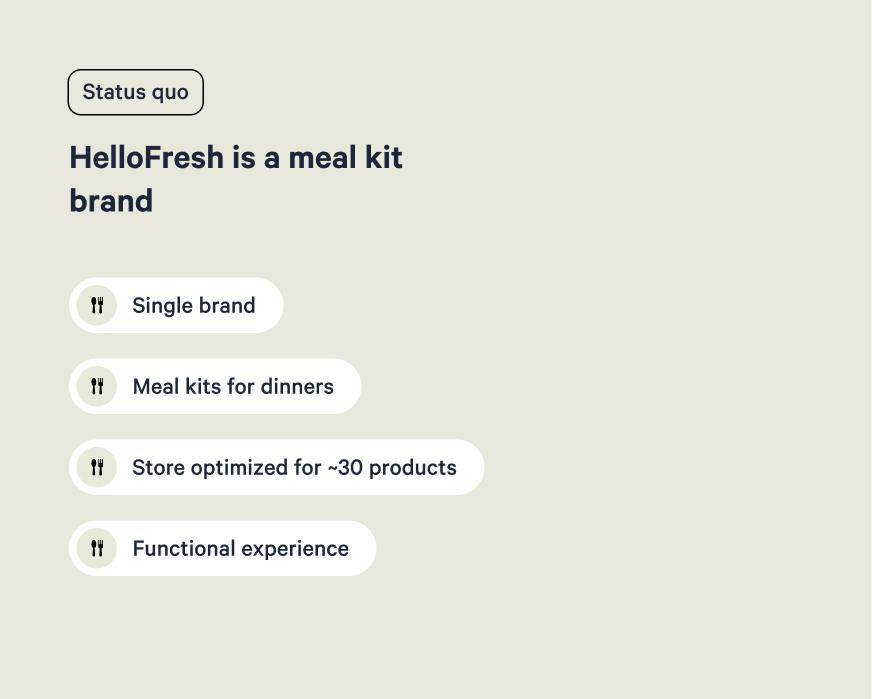
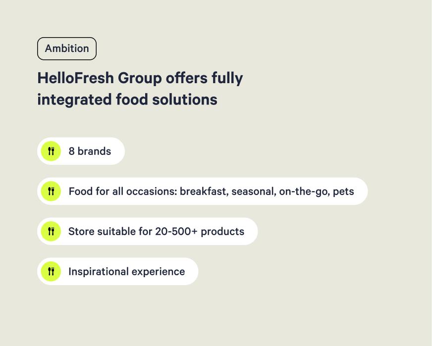
HelloFresh operated as a single-brand marketplace optimized for ~30 dinner meal kit products, but the company's ambition was bigger: becoming a comprehensive food solution provider serving multiple brands, diverse meal occasions (breakfast, lunch, dinner, on-the-go, special), and scalable product volumes from 30 to 1,000+ SKUs across 17+ countries.
But our customers said...

The group was facing a massive missed revenue opportunity: 60% of the customer base was not engaging with the expanded product portfolio offering, despite the company heavy investment in offer diversification.
So we revamped the store
We created a white-label marketplace system, focused first on HelloFresh but that would scale across other brands, while maintaining each brand's unique identity and emotional connection, evolving the shopping experience from functional to inspirational, enabling discovery across expanding product catalogs, and empowering internal teams with tools that support product storytelling.
Impact at a glance
Platform scalability
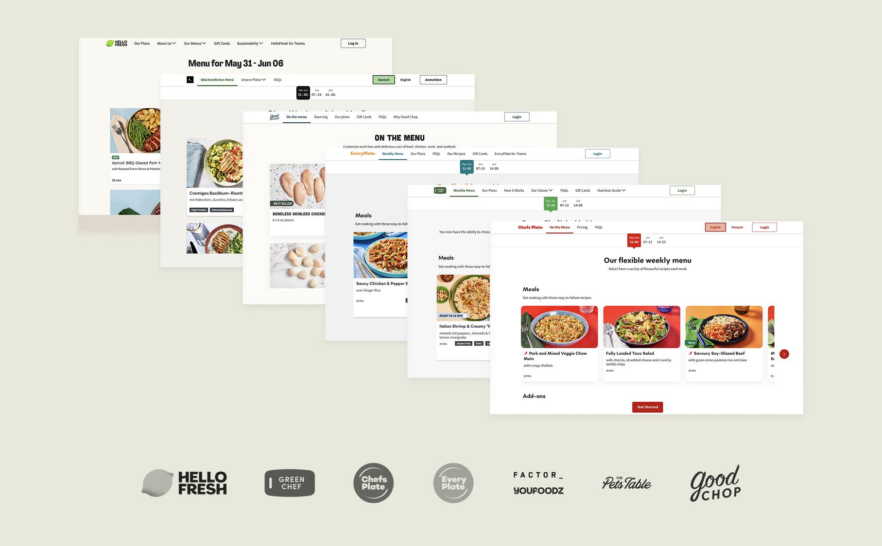
- ✓Scaled from 1 brand to 8 brands across 17 countries
- ✓Empowered assortment teams to better leverage their curation work
- ✓Enabled tech teams to build and test new features faster through a more modular system
A few success metrics as of December 2024
- ✓Customers added one more item per order on average
- ✓0.8% fewer paused subscriptionsg
- ✓0.7% fewer cancellations
- ✓5% more add-on products purchased
Categories —
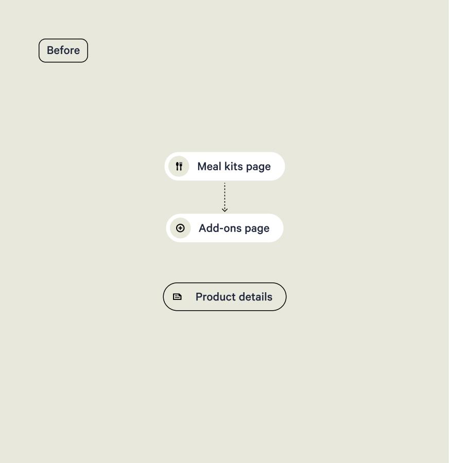
A bold architectural and navigational change.
Our previous digital experience failed at reflecting the variety of food that HelloFresh offers: the only way for users to navigate was to cumbersomely scroll through plain lists of products.
We built a brand new category tree, categorization system and category navigation.
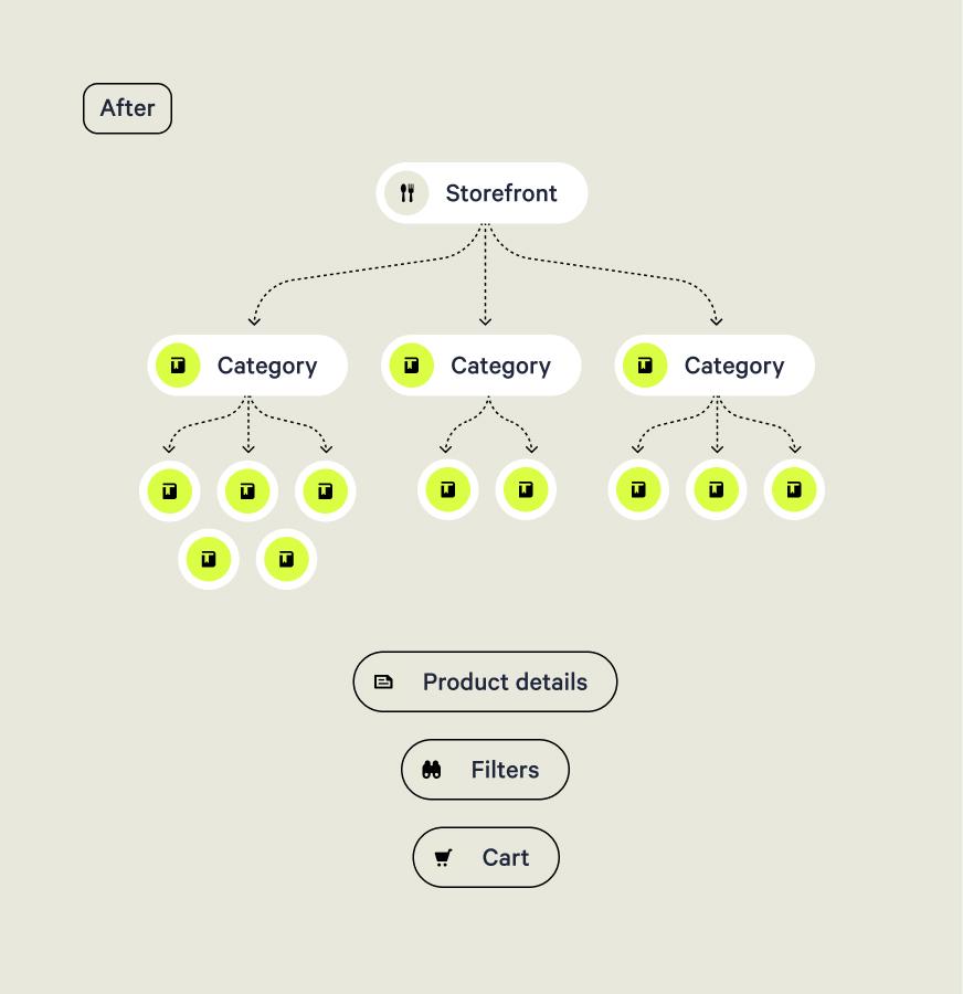
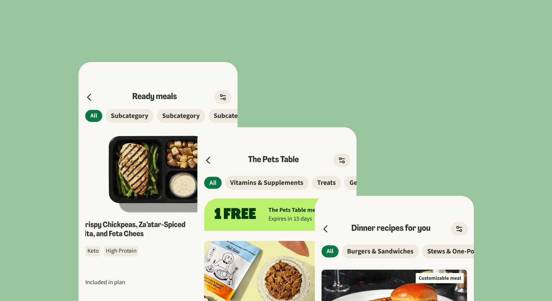
Drill down to exactly what you're looking for.
We’ve designed a system of parent and subcategories so customers can browse the catalog with precision and find exactly what they need.
Find what you love, discover new things.
Local teams could spotlight seasonal categories each week, helping customers uncover fresh products alongside familiar ones.
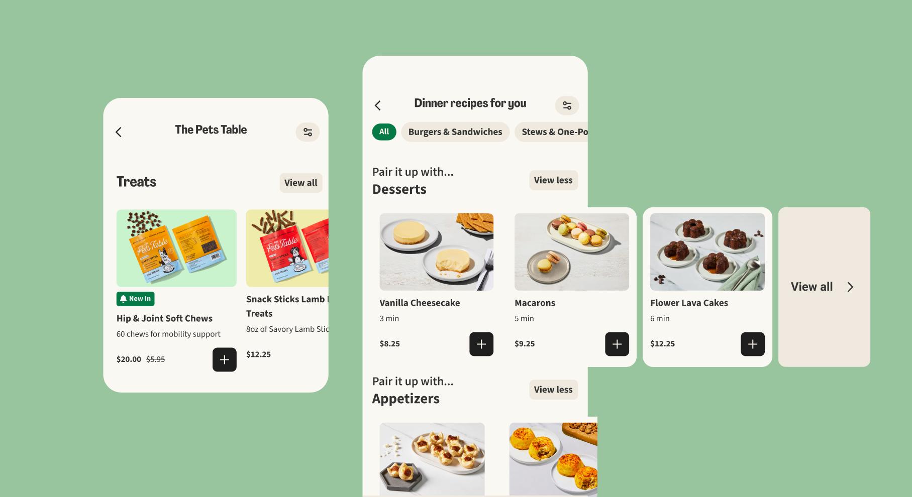
Let our suggestions spark new ideas.
By mapping related categories, we’ve made discovery effortless, we invite users to explore new categories that connect to their interests.
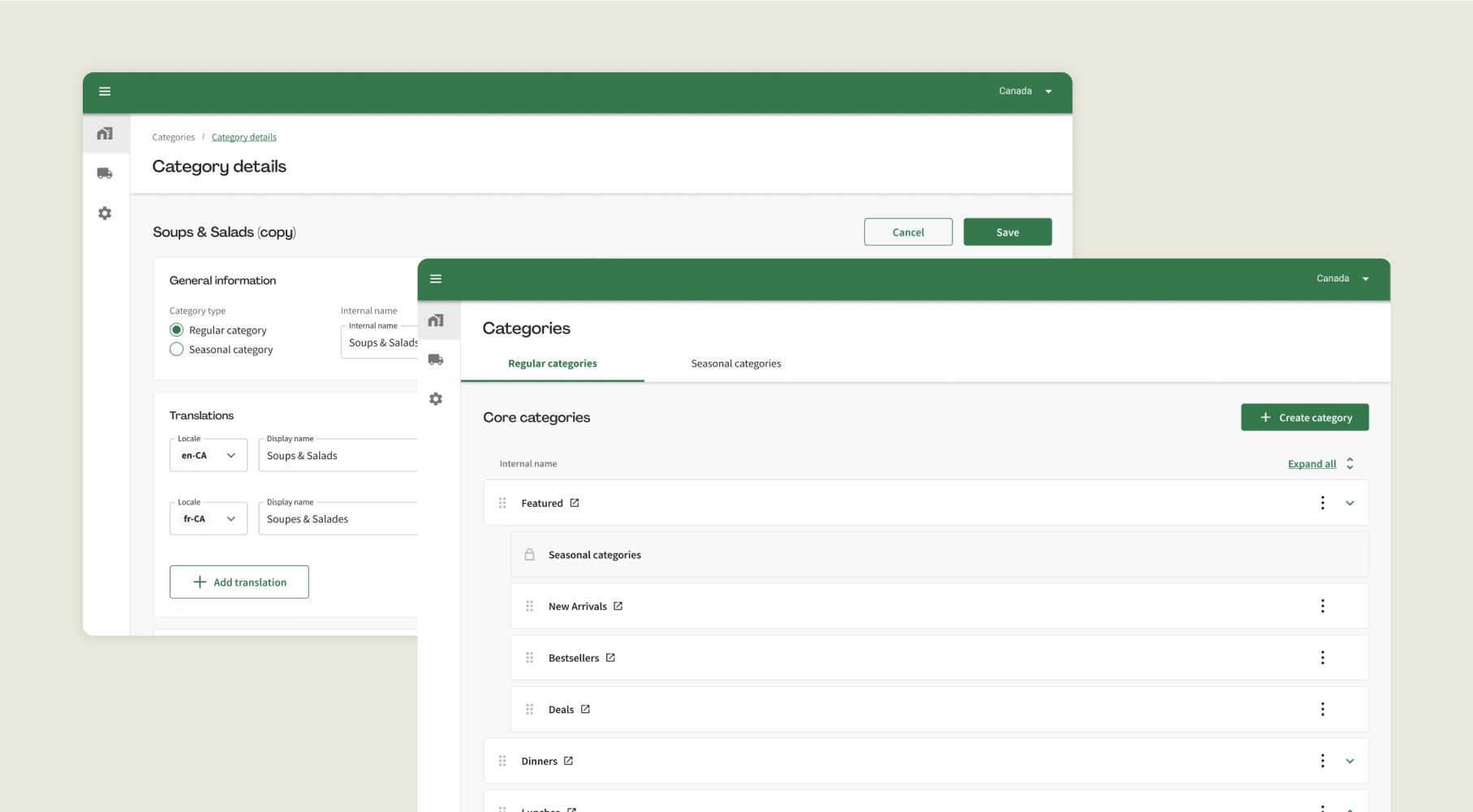
Category management tool
Mirroring the consumer-facing category experience we built, I designed a new category management internal tool to enable content editors across 17 countries to create and populate categories.
Storefront —
Bringing in the emotional touch.
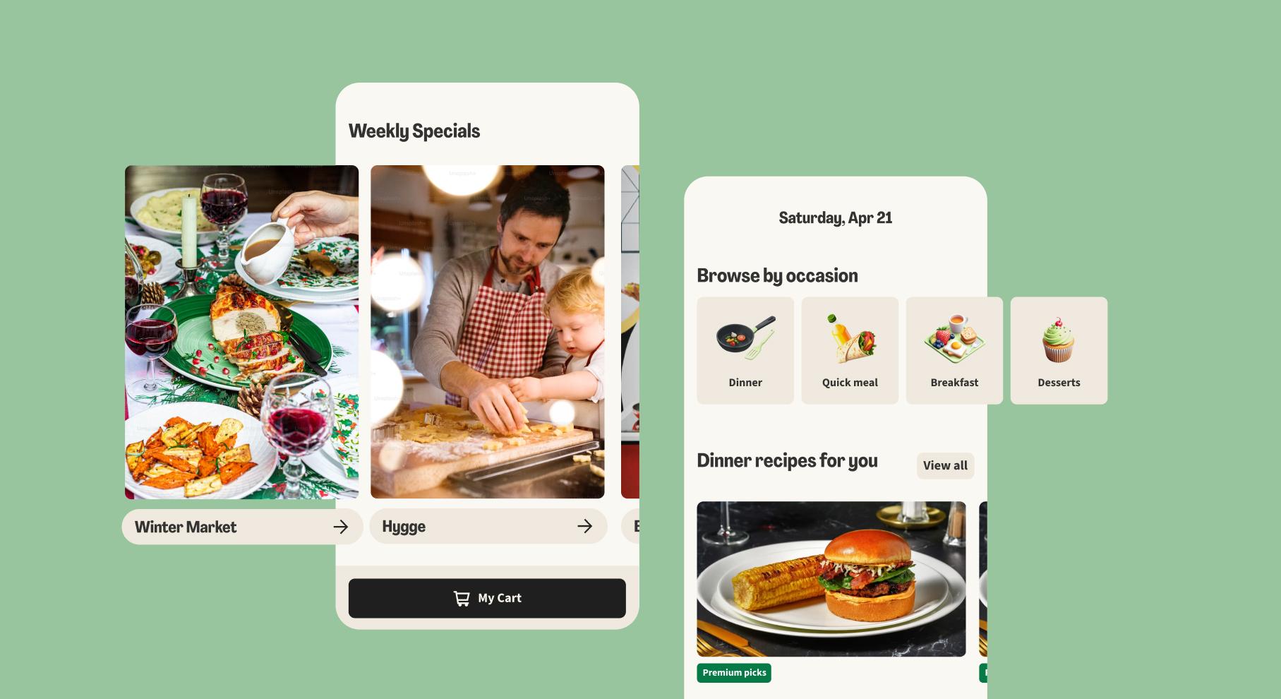
Discovery requires context, not just access. Simply making products more accessible and visible through categories (or later: filters) didn't successfully increase purchases: users needed inspiration and relevance.
That is why we created the Storefront: the entry page of the weekly store. The Storefront is a curated feed that showcases the variety of the brand's offering through a diverse array of featured products, categories, and personalized recommendations. Similarly to a brick & mortar shop window, the digital Storefront aims to captivate and entice visitors with an engaging and visually appealing display of the latest offerings.
- ✓Personalization first
- ✓Visual storytelling
- ✓Contextual discovery
- ✓Brand embodiment
Samples of the HelloFresh storefront
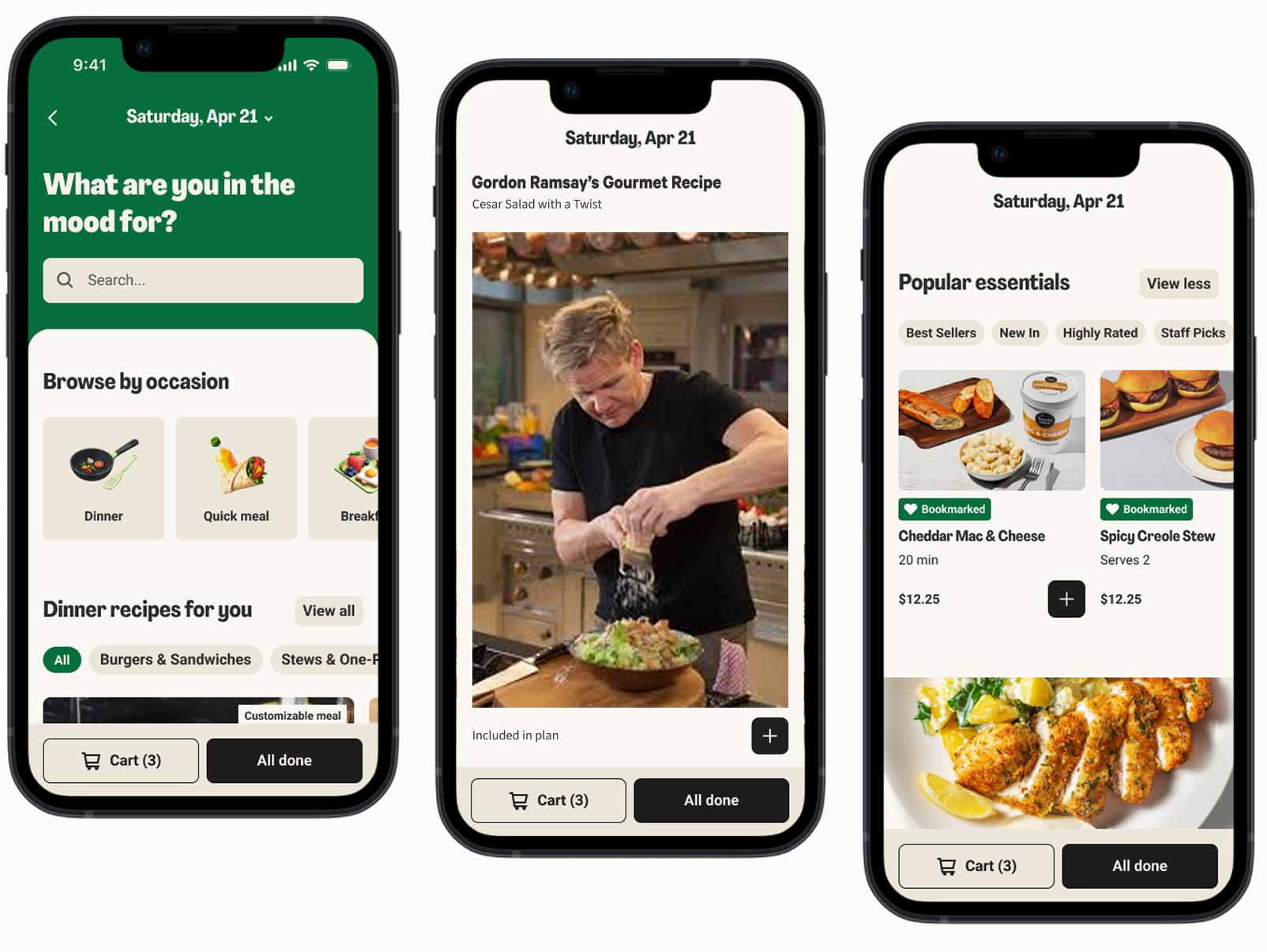
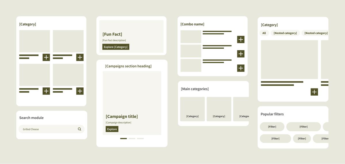
A brand-agnostic widget system
The Storefront is first and foremost a highly configurable space, based on a system of widgets which can be populated, tested, reordered across brands, countries, from week to week, and personalized to each customer.
Provisional long-term impact:
- ✓+15% increase in customer lifetime value among active users
- ✓Customers will place 0.5 more orders per year on average
Other contributions
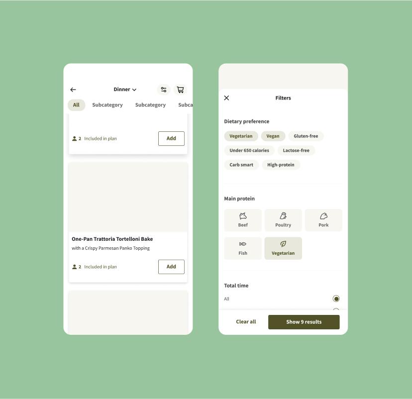
Sort & Filter
I designed the vision, base logics and navigation principles for the Sort & Filter feature, before handing it over to another designer for delivery.
Impact of the first version:
- ✓Pause and cancellation rates decreased, reflecting higher engagement and satisfaction
- ✓Significant drop in customer complaints related to filtering in Unit Q reports
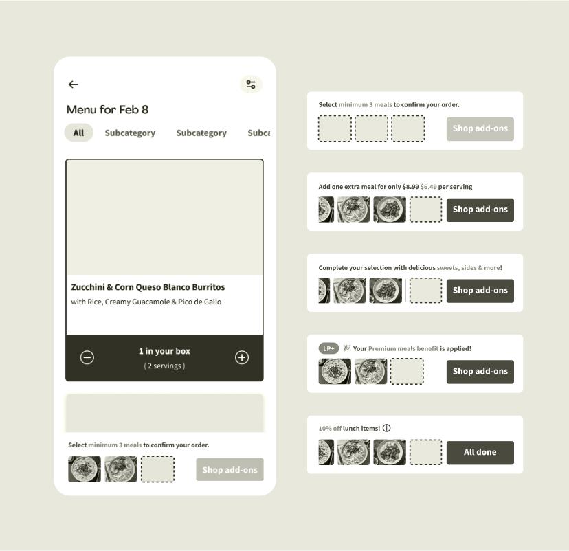
Cart & Selection wizard
As the store experience evolved and the assortment became more complex, I spent several years mentoring the team’s designers on improving the information architecture of the cart, helping them clarify the structure, hierarchy, and logic behind key interactions.
Building on that foundation, I later designed the selection wizard, a space for orientation and tracking within the shopping flow. It helps both new and returning users stay aware of their progress, understand how to complete their order, and confidently make the most of available discounts.
Impact:
- ✓6% fewer customers abandoned their baskets during meal selection
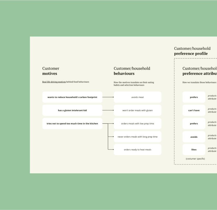
Personalization algorithm design with data science
I worked with the data science team to turn complex recommendation algorithms into user-centered personalization. I introduced an "observation path" framework that links customer behaviors (clicks, browsing, adds, skips) to underlying motivations like convenience, health, variety, or deals.
This approach enabled dynamic preference profiles based on implicit signals, making product recommendations feel genuinely personalized.
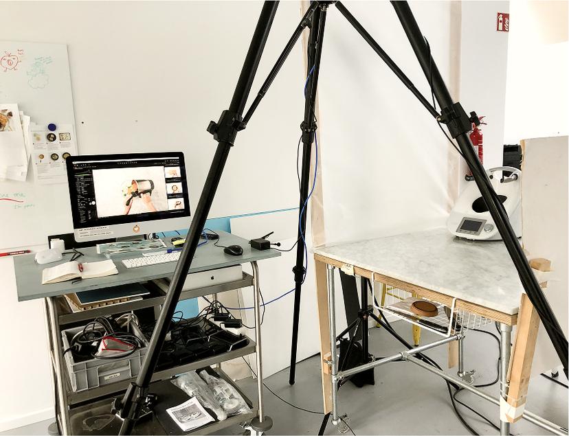
A/B testing framework for visual content strategy
We partnered with the photo studio team to rethink how food is represented across the storefront. Moving beyond static flat-lay photography, we imagined a framework for A/B testing new imagery formats: short-form videos showcasing recipes in action, lifestyle visuals connecting food to real moments, portrait-style ingredient shots or in-progress cooking scenes.
This approach would allow us to test which types of visuals best drive engagement, while broadening how HelloFresh communicates taste, freshness, and inspiration.
Words from the team

“Clara's unique blend of creativity and strategic thinking had a transformative impact on our product development.”
Jordy
Director of Product @ASOS, ex-Amazon

“She delivers impact through leadership, collaboration, and an unwavering commitment to delivering excellence.”
Jeanna
Sr. Director of Product Design @HelloFresh
What did I learn?
Designing systems, not just solutions
You could see in this case study, we solved HelloFresh-specific browsing and discovery pain points, but the real solution was a scalable architecture that enables future evolution, resilience, and flexibility.
We designed for the problem at scale, not just the immediate need.
The strength of such systems isn't just in their structure, it's also in how they empower others. Once the foundation is in place and collaborators understand how to leverage it, impact becomes exponential. 6 brands launched, 17 countries enabled, countless content managers empowered with efficient tools: this multiplier effect is what turns individual contribution into organizational leverage.
Co-creation over handoff
People support what they help create. I fostered around the project a highly collaborative space: leveraging product and engineering forums for strategic and system brainstorming, setting feedback loops with senior stakeholders, and using vision prototypes (1-year, 5-year) as conversation starters.
Designing with intuition, writing for influence
I design from intuition, I move quickly toward what feels right, but I write to make those ideas resonate at scale.
In a complex stakeholder landscape spanning multiple product verticals, org layers, and time zones, I used written artifacts (vision docs, decision logs, principle frameworks, ...) to drive asynchronous alignment. This approach ensured that design decisions not only felt well-founded, but also connected clearly to company goals and earned stakeholder trust.